
Project Overview
Achievements
First Draft
Second Draft
Final Version
Project Overview
Waterlili Health Coaching was created to help individuals unlock their effortless vibrancy—rediscovering the healer within while embracing the supportive community around them. The goal was to create a cohesive and scalable brand identity that harmonizes nature-inspired elements with wellness, nutrition, and mindfulness.
The project aimed to capture the essence of the brand’s mission: to guide women in their 20s-30s who feel something is missing despite leading “successful” lives. These women have tried countless diets and wellness trends but still don’t feel vibrant. The branding needed to meet them at this vulnerable moment, offering warmth, clarity, and a pathway to personal healing.
Visually, the brand focuses on waterlilies—a symbol of purity, healing, and resilience. The design journey explored ways to blend this motif with a modern, playful identity that feels personal, approachable, and uplifting.
Achievements

Cohesive Brand Identity
Developed a unified brand system with logos, typography, and color palettes that reflect Waterlili’s mission of holistic well-being.
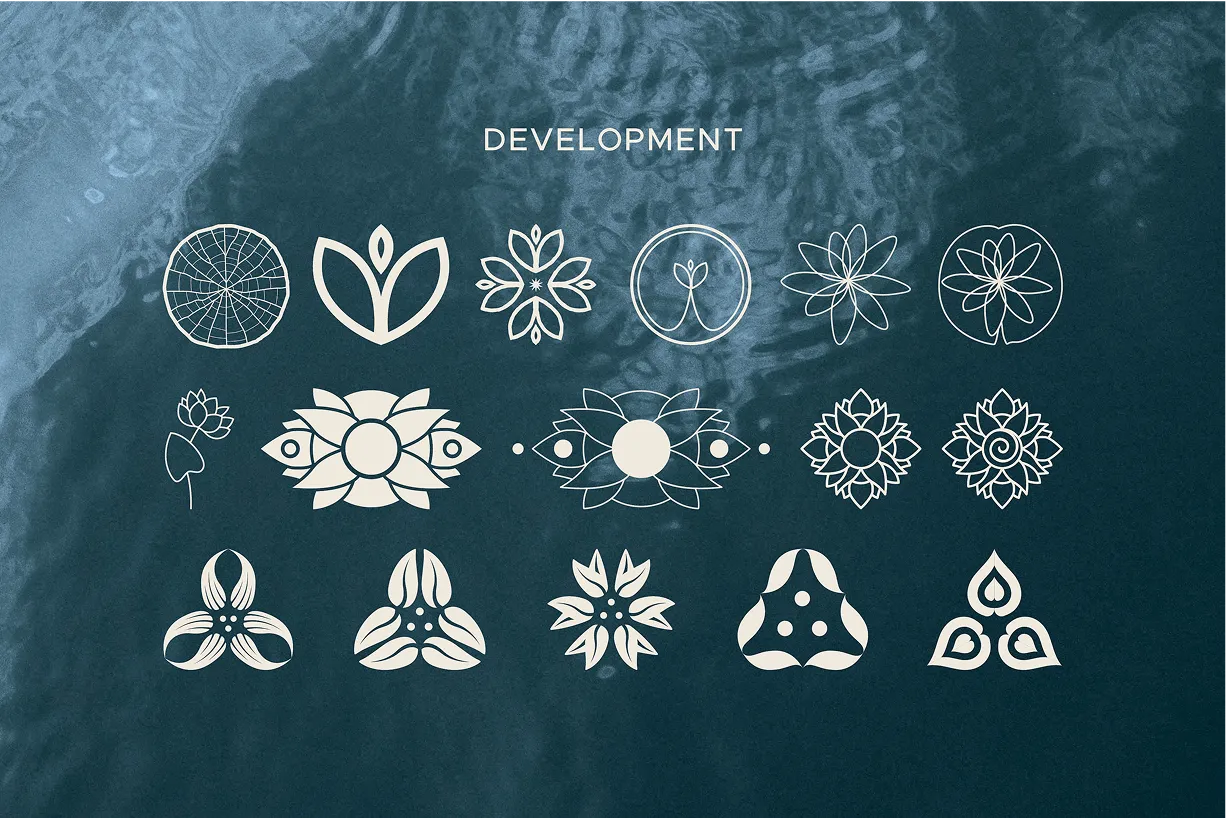
Logo Exploration & Finalization
Created a versatile logo suite blending nature-inspired elements with playful typography for use across digital and print.

Refined Color Palette
Designed a nature-inspired palette with jewel tones and a pink-orange gradient to enhance vibrancy and warmth.

Target Audience Alignment
Crafted visual storytelling that resonates with women in their 20s-30s seeking balance, wellness, and growth.
Flexible Brand Assets
Delivered scalable assets, including mood boards, typography guides, and templates for consistent multi-platform use.

Emotionally Engaging Visuals
Curated imagery focusing on mindfulness, nutrition, and community to foster emotional connection and trust.
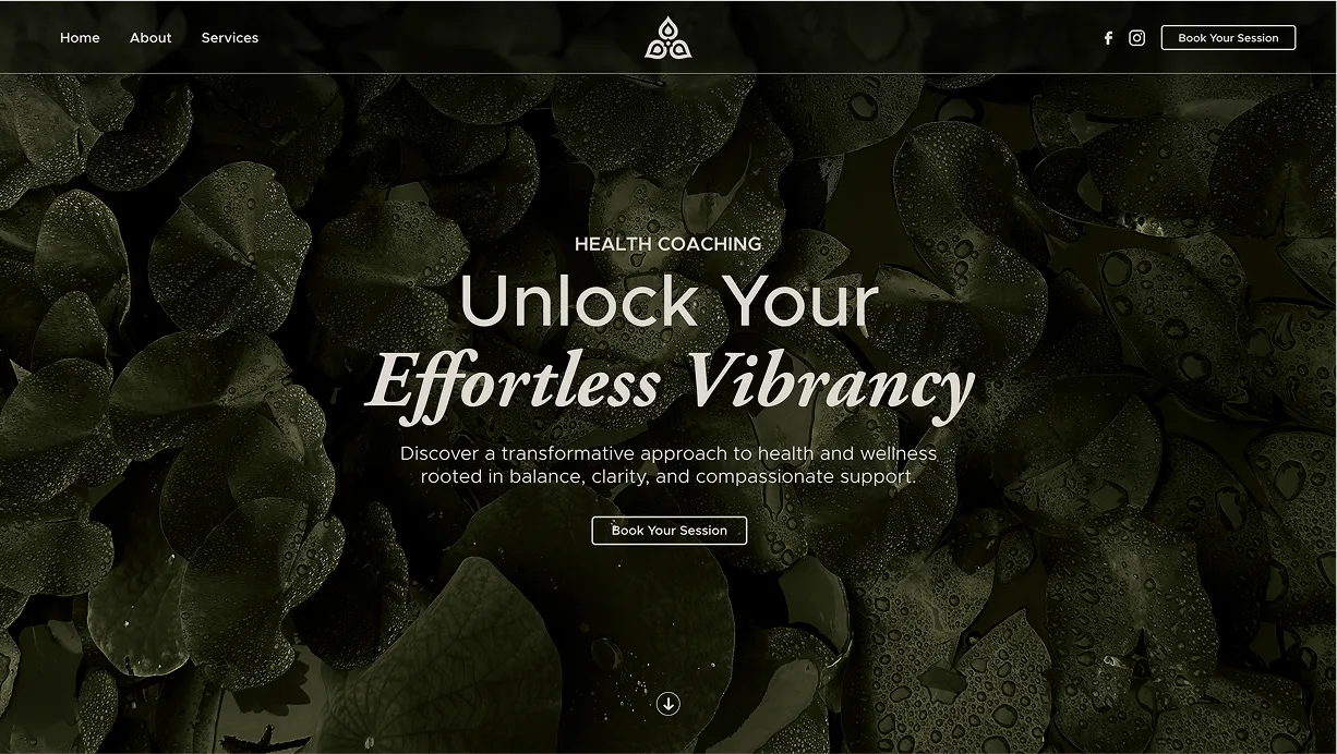
First Draft — Exploring Nature & Wellness
The initial design blended elements of nature—especially water and waterlilies—with themes of nutrition and personal well-being. Deep earth tones, like rust and olive, paired with organic textures, aimed to create a grounded and natural feel.
The logo featured an abstract waterlily-inspired icon alongside bold, serif typography, lending a sense of strength and stability. Imagery highlighted holistic living—focusing on nutrition, mindfulness, and everyday rituals like sipping tea—to align with the brand’s wellness mission.
While the foundation felt solid, the darker color palette and structured logo leaned too formal, lacking the playful, approachable energy the brand needed.
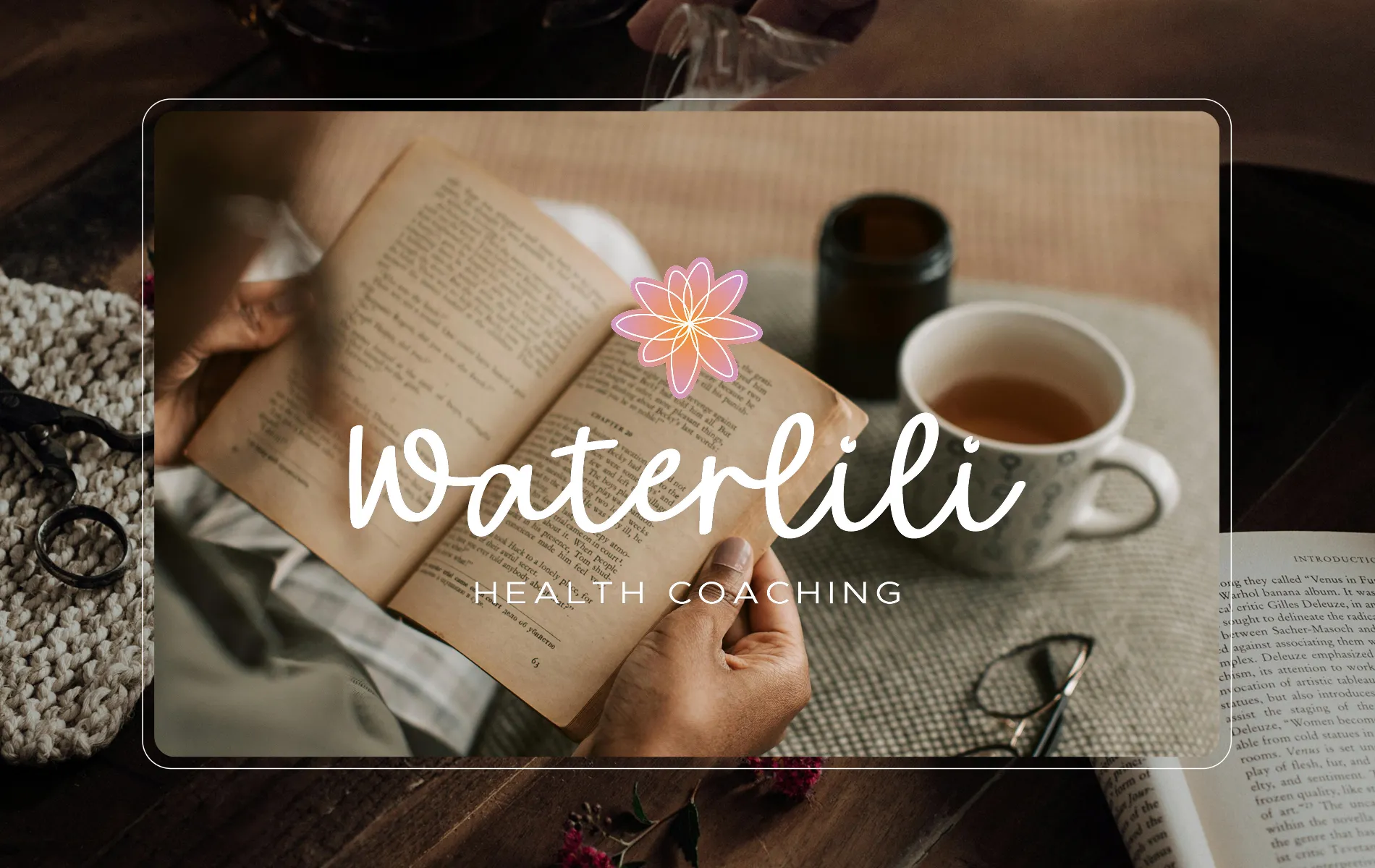
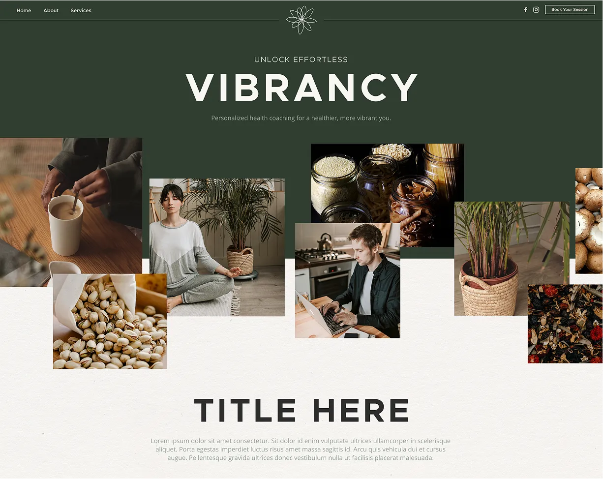
Second Draft — Lightening the Mood
Building on feedback, the second draft introduced a lighter, more playful direction. A new pink-orange gradient—sampled directly from waterlily petals—became the focal point, infusing warmth and vibrancy into the brand palette. This move balanced the grounding greens and blues, creating a more modern and approachable aesthetic.
Key Updates in This Draft:
- Color Palette: Shifted to lighter, neutral tones with a signature gradient for balance and vibrancy.
- Typography: Introduced Metropolis (modern sans-serif) paired with Anggeliana (elegant script) for a playful, human touch.
- Logo Refinements: Simplified the waterlily icon and introduced more organic typography.
- Imagery Overhaul: Focused on real-life moments—reading, journaling, and wellness activities—to align with the brand’s mission.
The overall aesthetic transitioned from darker, more serious tones to a brighter, more natural feel. This draft successfully aligned the visuals with the brand’s mission, offering a hopeful and inviting experience for its target audience.
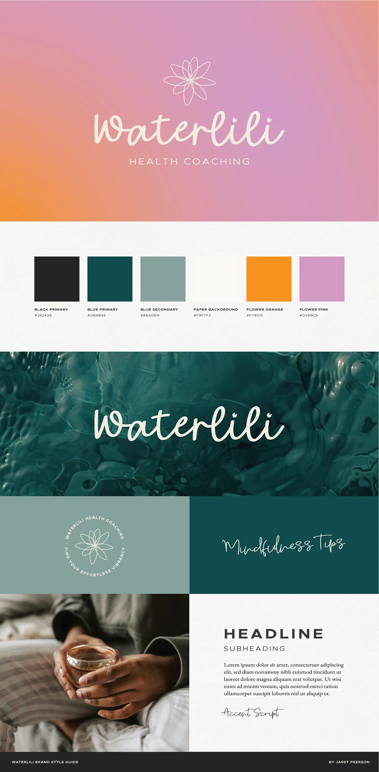
Final Version — Unlocking Effortless Vibrancy
The third and final draft built on the momentum of the second, refining the visual identity into its most polished and cohesive form.
Key Updates in This Draft:
- Logo: The final logo adopted a more playful cursive typeface, exuding warmth and approachability.
- Color Palette: A teal tone replaced the darker green, softening the brand and adding freshness. The pink-orange gradient remained central, becoming a signature element.
- Typography: The script font took a more prominent role, bringing out the brand’s playful, human essence. The pairing of cursive and sans-serif fonts created a balance between approachability and professionalism.
- Tagline Refinement: Simplified the subheading from “Find Your Effortless Vibrancy” to “Unlock Effortless Vibrancy”—a stronger, more action-oriented statement that resonates with the brand’s mission.
The final identity perfectly blended nature, wellness, and modern aesthetics, offering Waterlili Health Coaching a vibrant yet grounded brand presence that authentically speaks to its audience.